|
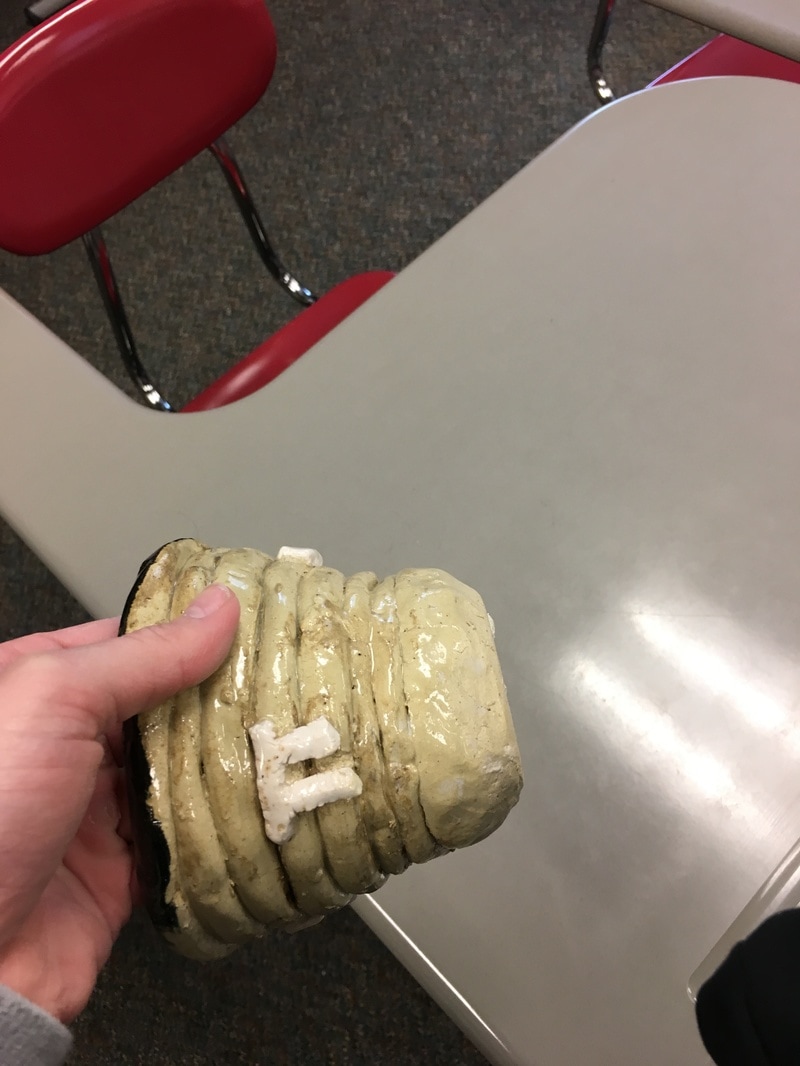
Below is the Franken pot that Cara and I made. We actually threw our pot the week after spring break because we were both absent when everyone else in the class made theirs. With our designated sized pieces of clay, I made the base of the frankenpot and Cara used the tools to make the portion. Our pot is smaller than others because our group only has two people, and so it only has two cylinders on it. We connected the pieces on the wheel and trimmed with a #7 tool. 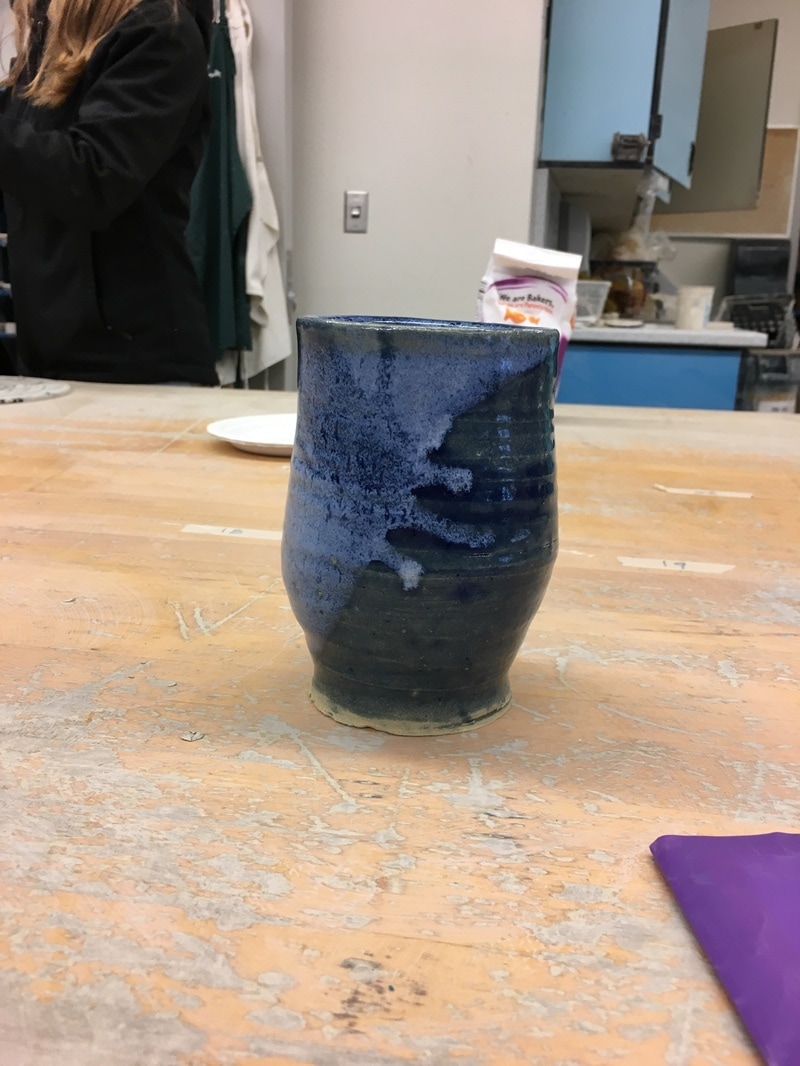
0 Comments
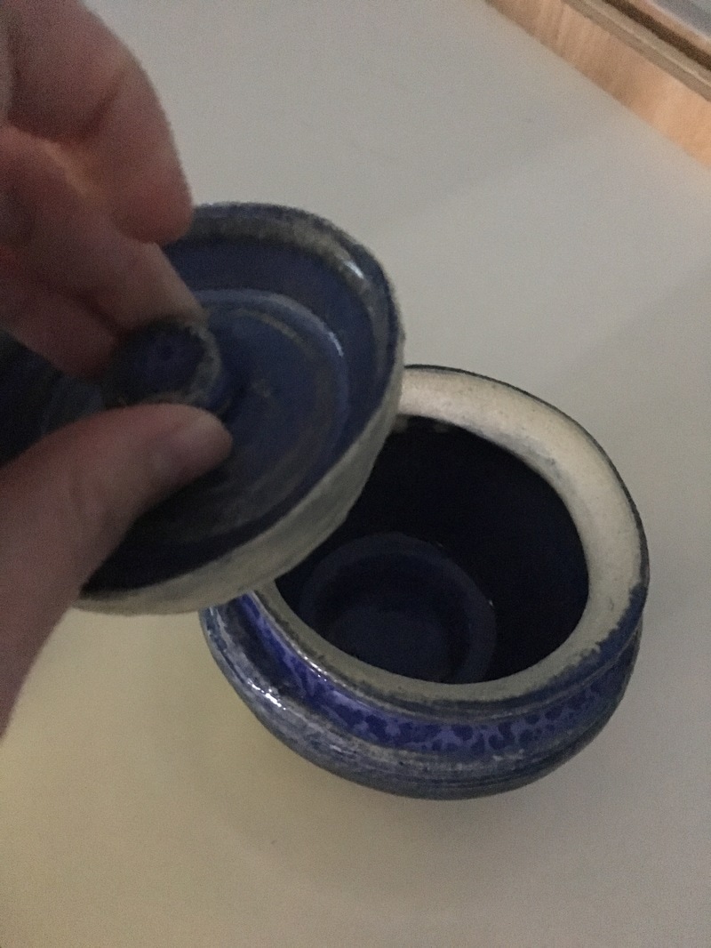
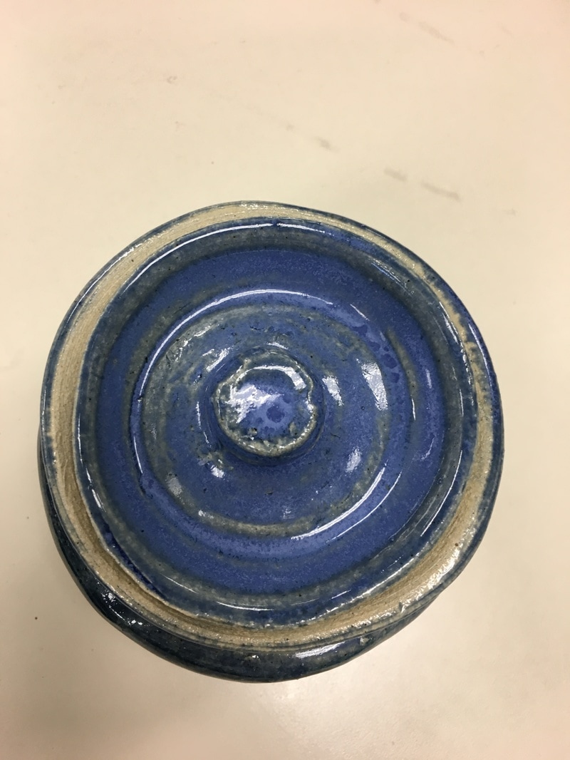
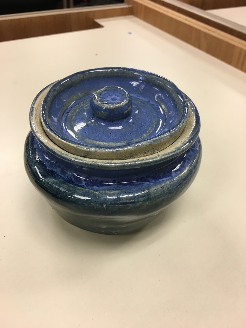
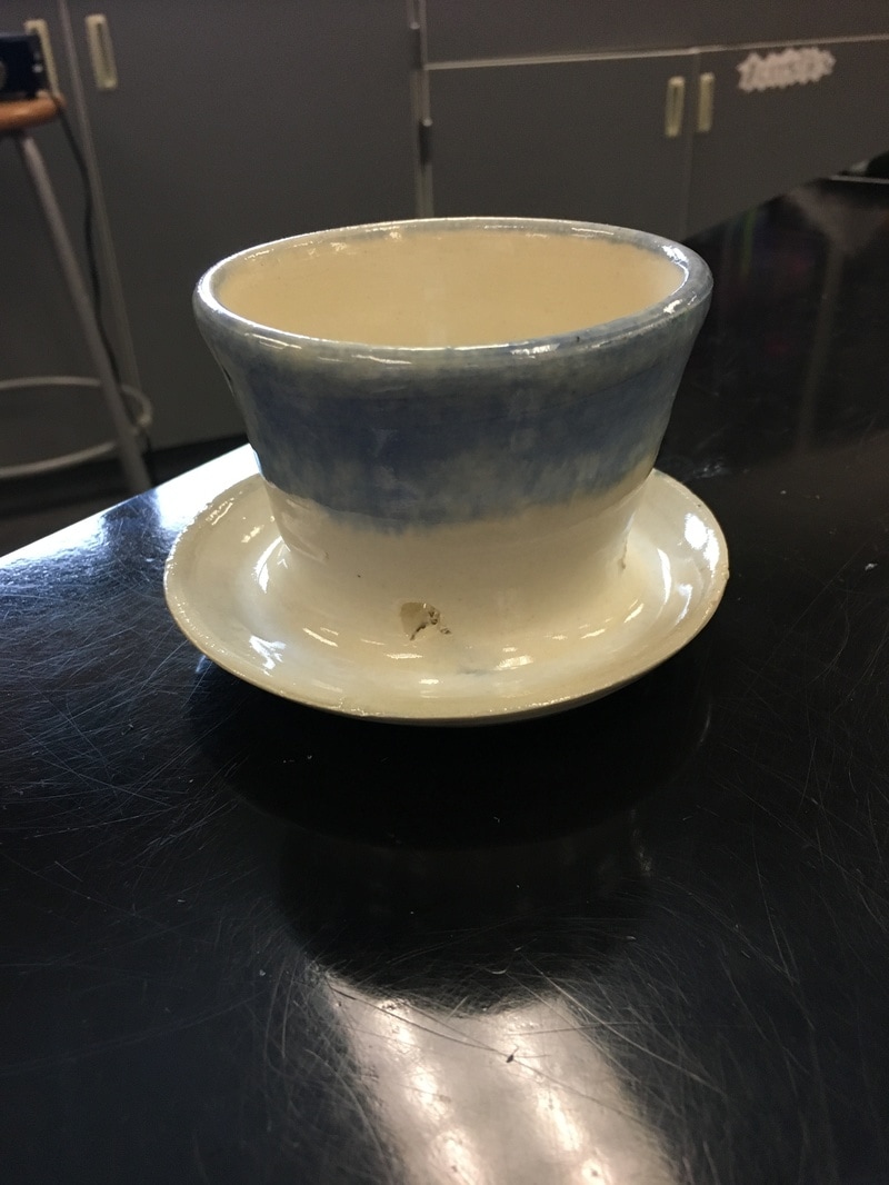
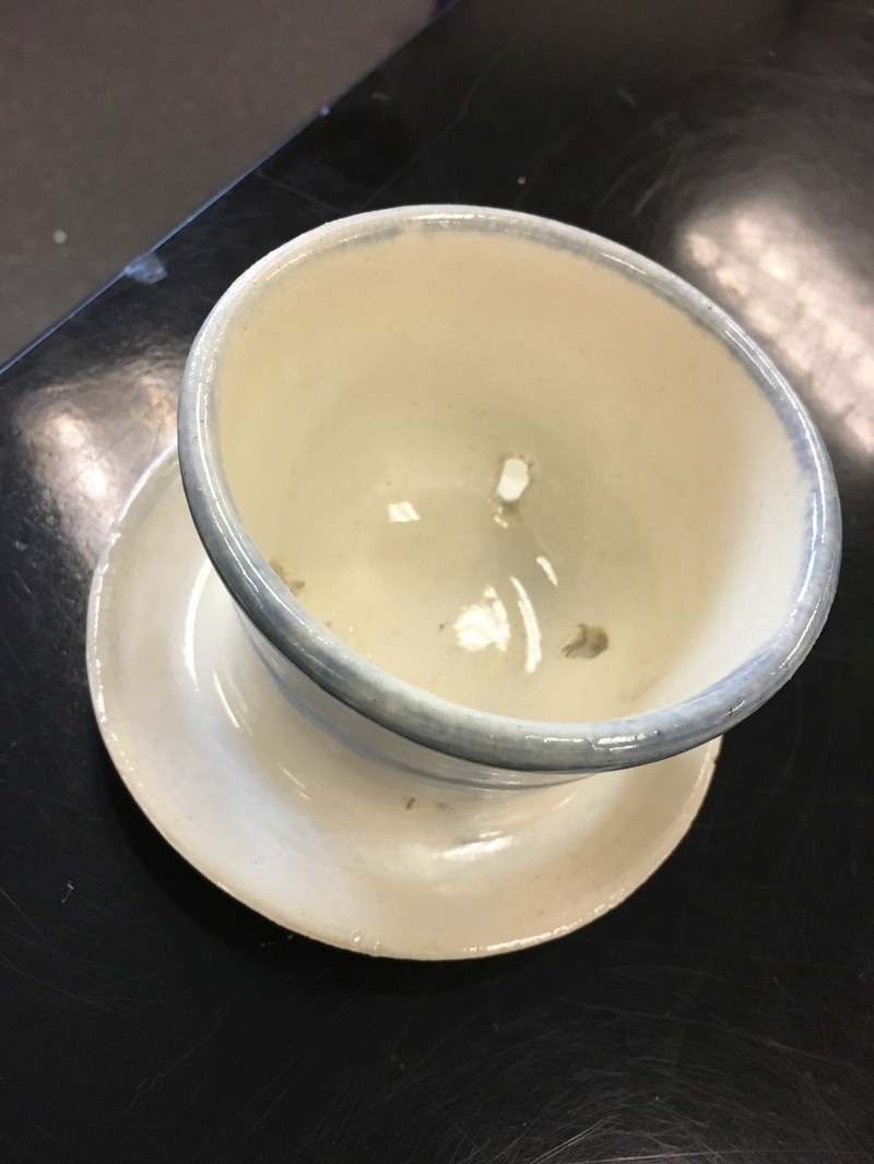
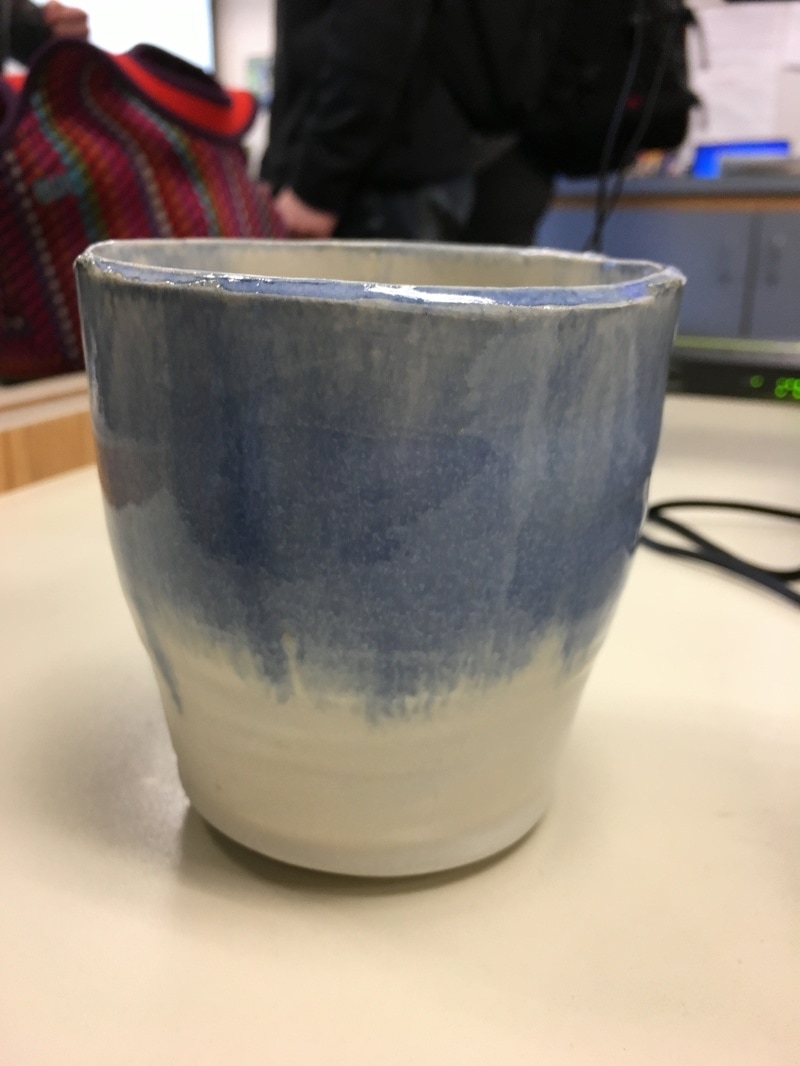
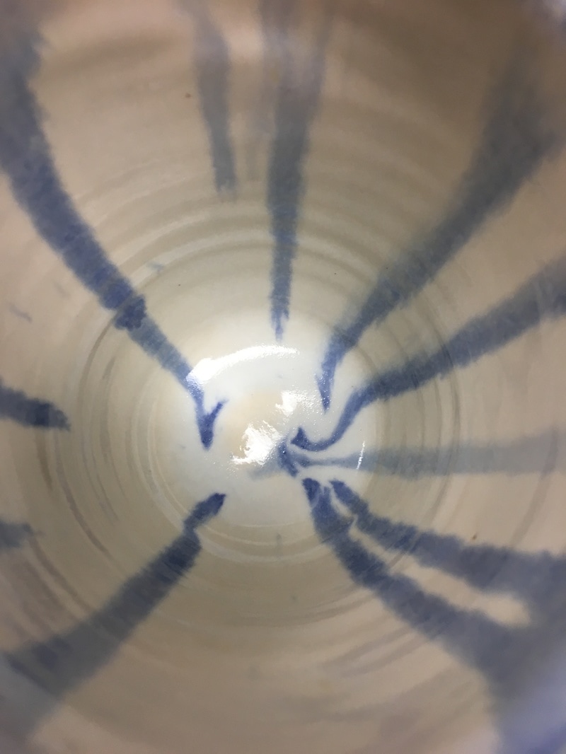
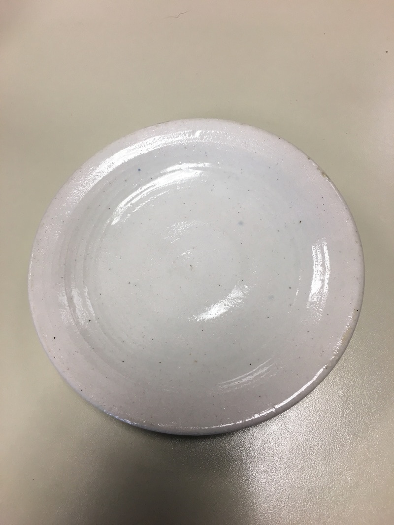
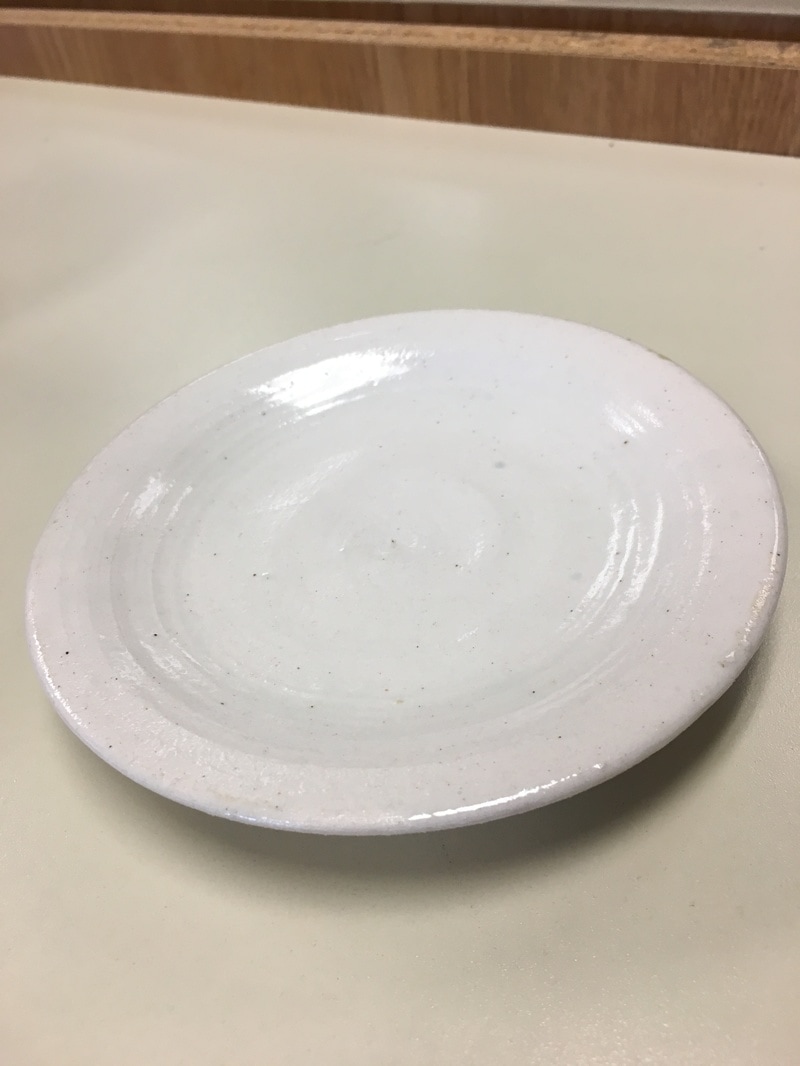
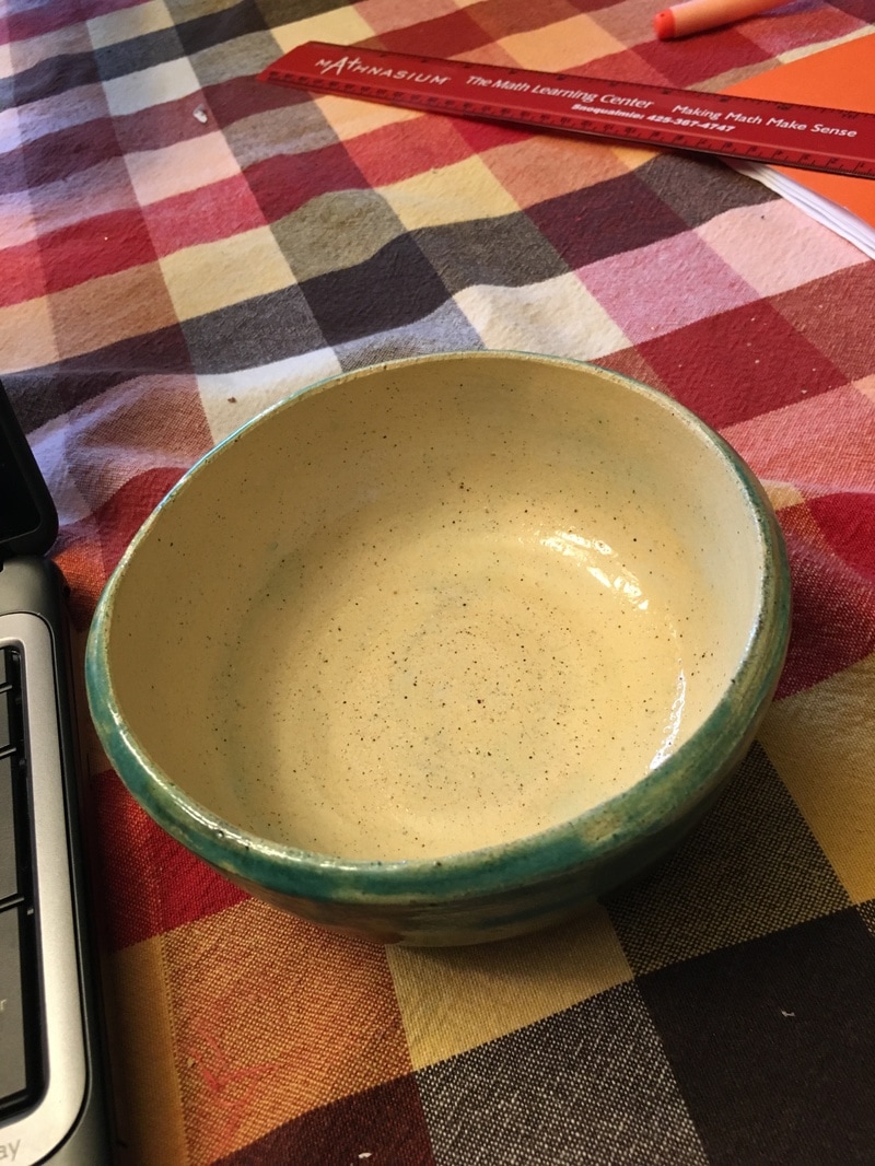
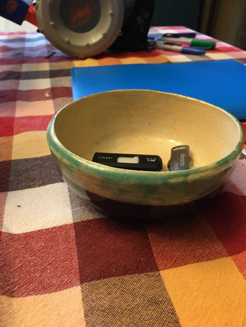
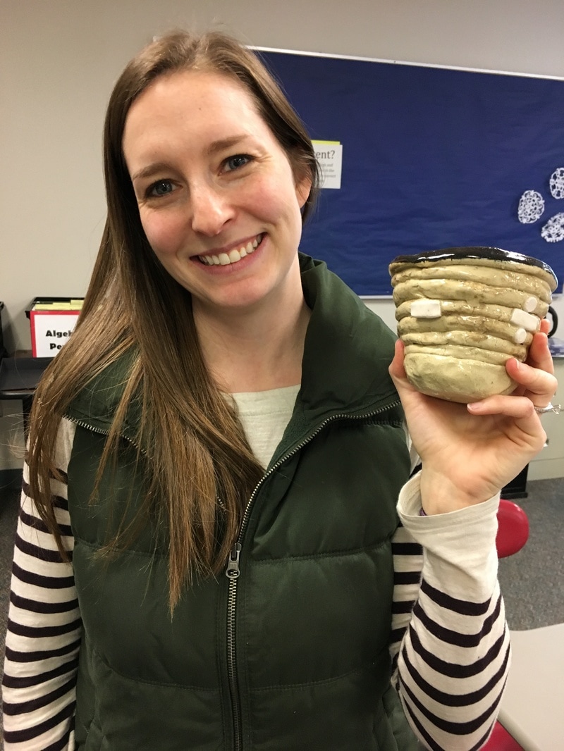
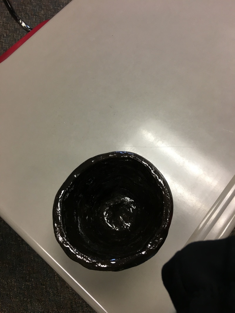
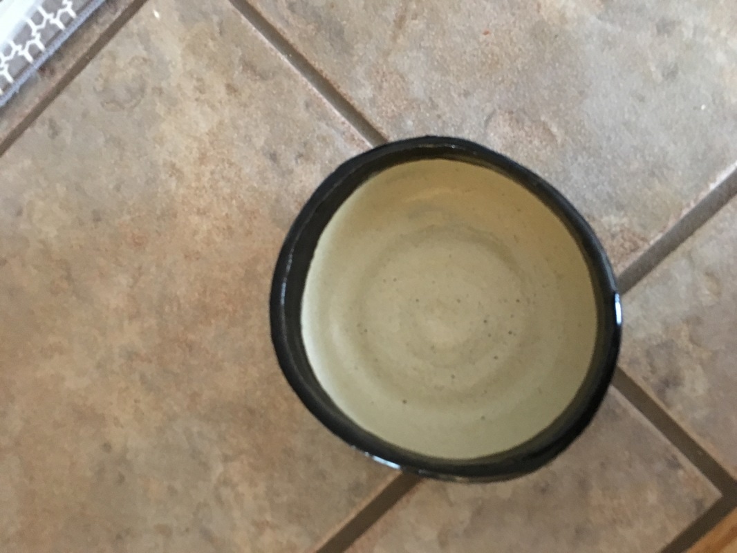
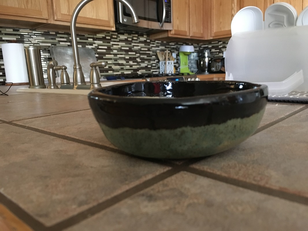
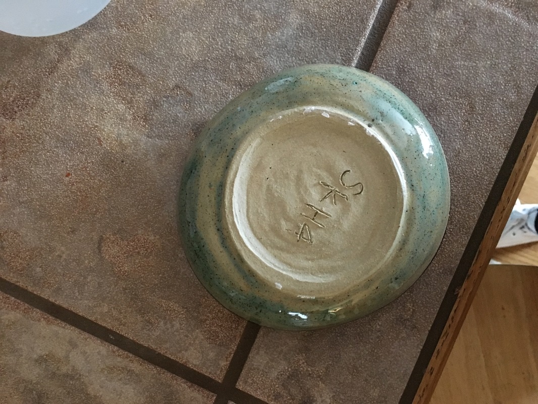
This is my lidded project. It is 3.5 inches has the most narrow point, and 4 inches at the widest point. It is 4 inches tall. This project features a lid which I threw on the wheel. It is glazed with Sydney’s blue near the lip, on the lid, and inside of the jar, and with Forrest Cobalt on the bottom of the jar. A new skill I learned to make this was how to use tools to measure how big to make the lid, so that it would sit inside of the lip. I find this piece appealing because of the unique form: the jar gets gradually wider, then suddenly narrows at the neck. The form of the lid is also unique because the outer walls are taller than the rest of the lid near the handle. This form creates movement in a piece because the viewers eyes naturally follow the curvature of the walls of the jar. Overall, my lidded project gives me a feeling of fluidity, not only through the movement of the piece but through the glaze colors because they remind me of ocean colors -- especially at the thin line where the Sydney’s blue meets the forest cobalt. This is my planter. The base is 5 inches wide and it is 4 inches tall. It features four drainage holes, which make it into a functional planter. I glazed this with white glaze, then I used Sydney’s blue near the lip. A new skill I learned to make this project was how to open a centered piece of clay twice -- so that I could make both the pot and the base. As with most planters, mine has an interesting form -- there are holes through the walls, and it has many different widths which makes it stand out from other projects. The form of my planter displays proper proportions in my project, because the main pot is significantly taller than the base. These characteristics combine to create a feeling of simplicity because simplicity is often associated with nature, and I used simple ideas and colors to make a difficult project. This is my tall project. It is 5 inches tall and 4 inches wide at the lip. It is glazed with white underneath with Sydney’s blue on the outside and dripped down the inside walls as well. A new skill I had to learn was choking between pulls, because I have been having a hard time with doing this. The way the blue glaze fades down the outside creates a unique value as the blue bleeds into the white glaze. This change in value goes to create movement as the color changes leads ones’ eye down the walls of the project. Overall my project creates a feeling of peacefulness because the movement reminds me of the way rain can drip down a window. Next quarter I am hopeful to be able to pull a vase! This is my choice #2 project. It is a small porcelain plate. The plate is 5 inches across, featuring a compressed lip around the edge. The only color on this plate is the natural coloring of the fired porcelain, as I glazed it only with a clear glaze. A new skill I learned was how to make a concentric ring pattern on the plate. These rings create a series of lines on the plate. This continues on to create unity within my project because of the consistency of the porcelain color and the lines that decorate the plate. The lines and unity create an idea of simplicity that I find very appealing because the plate is not overwhelmed with too many ideas. This is my wheel cup project. The cup is 4 inches wide and 5 inches tall. It features a pulled handle which I attached using a slip and score method. The inside of the cup has a clear glaze, and the outside has a solid coat of shadow green. Something I learned to do was how to pull a handle -- it took a few attempts to be successful, however I am pleased with how the handle turned out. My cup displays form as the handle was pulled and attached to look proportional to the size of my cup. This goes to create unity through both the proportionality of my cup and through the consistent glaze color on the outside of the cup. My cup gives me comfort because green is one of my favorite colors, and because I could use the cup for coffee, which is another thing that I am passionate about -- along with my ceramics. 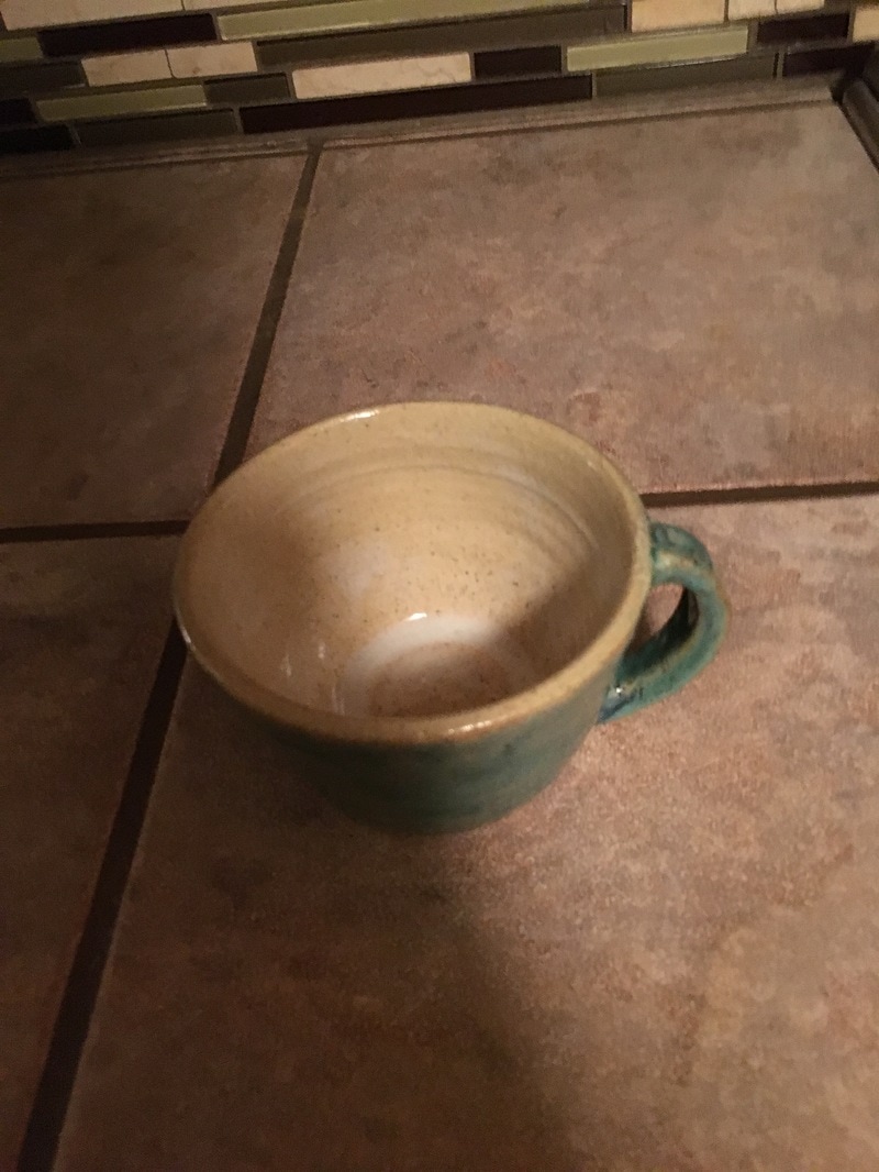 This is my choice #1 project. The pot is 4 inches tall and 3 inches wide at the base. I glazed this with sand on the outside and metallic brown on the inside. I chose these colors because my mother wanted a small holding pot that matches the backsplash on my kitchen walls. A new skill I used to make this was choking the cylinder between pulls because I had originally intended for this to be my tall project. I utilized texture and contrast in this proect. The texture is shown in the sand glaze on the inside of the pot, which greatly contrasts from the completely smooth glaze on the outside. I think this displays a feeling of accomplishment for me because this is the best glazing I have had on a project thus far. It is further accomplished because it matches the color of my kitchen, and I often feel accomplished when I cook something good in the kitchen, just as I feel accomplished when I throw a successful project. 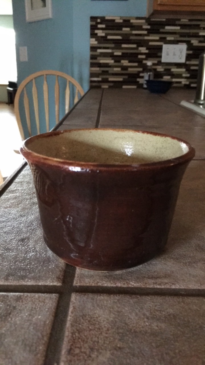 This was wheel bowl #2. This is four inches tall and 5 inches wide. For this project I glazed the inside with white, although I think I should have added another layer. On the outside I used dark cobalt and added mat turquoise with a sponge to add texture. A new skill that I learned for this project was trimming the lip. I could definitely use more work on this, but the lip on my bowl #2 is significantly better than on bowl #1. The art element that I tried to emphasize was form, through my attempts to make a good lip and even walls. The design element I wanted to emphasize was proportion/scale. This connected to the form of my bowl because I wanted a more even proportion of height to width on this project, because my last bowl was much wider than it was tall. I think I was successful at this design element. The mood I wanted to portray through this bowl was evenness -- this was shown through my proportions and form. The glazes were meant to add to this, by creating a solid coat on the outside, however I believe I needed to use more mat turquoise. Overall, I am very happy with the major improvements I can see within this bowl. This is my group’ coil project. It is 8 coils tall and about four inches wide at the lip. The surface features images of mathematical symbols which we created in porcelain. Additionally, the pot has an interesting texture because this is the nature of a coil pot. The inside is smooth. We used clear glaze on the outside and black glaze on the inside of the pot, and on the top coil. A new skill I used to creature this was the slip and score method. While I have done this before in freshman year, I had forgotten about it. I used this method to attach our symbols and our coils together. An art element I used were lines, and the lines created by the coils lead your eyes from one symbol to the next. The design element we used was proportion/scale, as we tried to make the coils of equal thickness and the symbols of similar sizes. Overall, I think this coil pot creates a harmonic feeling because it unites math and art together -- two subject which are often seen as very distinct but actually have many commonalities. This project was my first wheel bowl. It is 5.5 inches wide, 2 inches tall, and features a foot ring that has no glaze on it. I used a clear glaze on the inside of the bowl, shadow green glaze on the outside, and a black glazed lip which contrasts from the two other colors. A new skill I learned for this assignment was how create a foot ring, after letting the project sit overnight. This was an important skill because it helped me figure out how thick to leave the base of the bowl -- the first bowl I created had a base that was much too thin and I was not able to foot it -- forcing me to restart this project. An art element I tried to emphasize was color. I did this by including a solid black, the shadow green, and the clear glaze to showcase the natural coloring of the clay. To get a black lip I dipped the bowl into the glaze, which I liked the result of because the black slightly bleeds into the green, which I think is interesting. Based upon this, the design element I wanted to emphasize was contrast. I thought the contrast of colors would make the project more interesting due to the symmetry of the bowl in the first place. I think the dark black glaze really catches the eye and stands out. These contrasts create a changing mood within my project. The black provides a deep, dark feeling while green is typically associated with tranquility. This is interesting because it really continues to emphasize the contrast I wanted to include. |
AuthorWrite something about yourself. No need to be fancy, just an overview. Archives
June 2017
Categories |
 RSS Feed
